Still*
Gratitude is helpful - but it is not always simple
Still* is a reflective journaling app that helps people recognize meaningful moments without minimizing what they may be struggling with.
Role
Designer
Timeline
2 months (2025)
Skills
UI/UX Design
Tools
Figma
Making space for more than positivity
The emotional problem
Gratitude journaling is often framed as a simple way to feel more positive. But on difficult days, being asked to focus only on what is going well can feel forced, repetitive, or disconnected from what someone is actually experiencing.
The problem is not gratitude itself. It is the expectation that gratitude should replace frustration, sadness, or struggle.
What gratitude journals often ask:
What went well today?
What people may also need:
What felt difficult, and how are you carrying it?
The opportunity:
Still* explores how both questions can exist in the same reflection.
What I learned from research
User research
I reviewed academic research and public online discussions about people’s experiences with gratitude journaling.
145 papers
24,804 participants
28 countries
Choi et al., 2025 · PNAS
Insight
Design response
Gratitude is not universal
Gratitude practices may support well-being, but their effects differ between people and circumstances.
Still* offers multiple ways to reflect based on a user’s energy and emotional needs - from quick mood check-ins and gratitude moments to guided prompts and longer journal entries. Users can choose the level of reflection that feels manageable in the moment.
Positive and difficult feelings can coexist
Appreciation does not necessarily erase sadness, guilt, frustration, or stress.
Reflections make space for users to acknowledge what they appreciate alongside what feels difficult. Follow-up prompts encourage awareness without asking users to reframe, solve, or feel differently about their emotions.
Reflection can feel forced
Repetitive prompts and expectations to “find the positive” may make the practice feel performative.
Still* gives users control over how they participate. They can respond to a prompt, write freely, record a brief thought, or choose not to reflect at all - without streaks, forced positivity, or pressure to produce a meaningful entry every day.
Product principles
Acknowledge,
rather than correct
Encourage,
rather than require
Reflect,
rather than perform
Designing the core reflection experience
Core feature
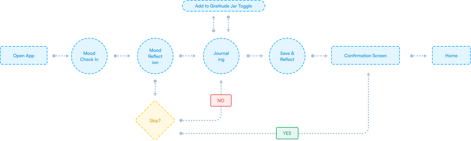
The central challenge was designing a reflection flow that offered guidance without telling users how they should feel. I mapped the experience around choice: users could begin with a mood check-in, respond to a prompt, record a gratitude moment, or write freely depending on what felt manageable.
Reflection flow
Reflection screens
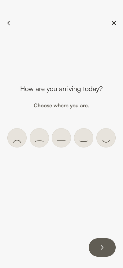
1. Starting with choice
2. Optional reflection

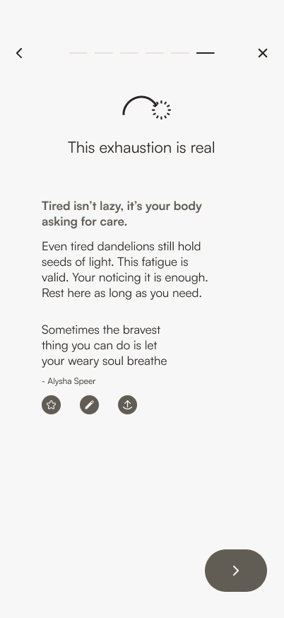
3. Acknowledging without correcting
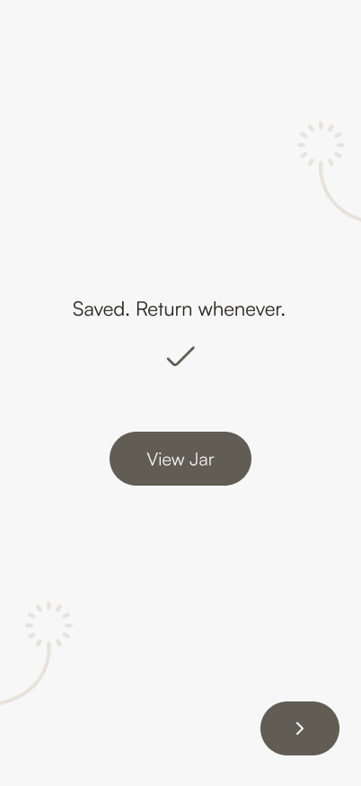
4. Saving what feels meaningful
Visualizing emotional growth
Design system
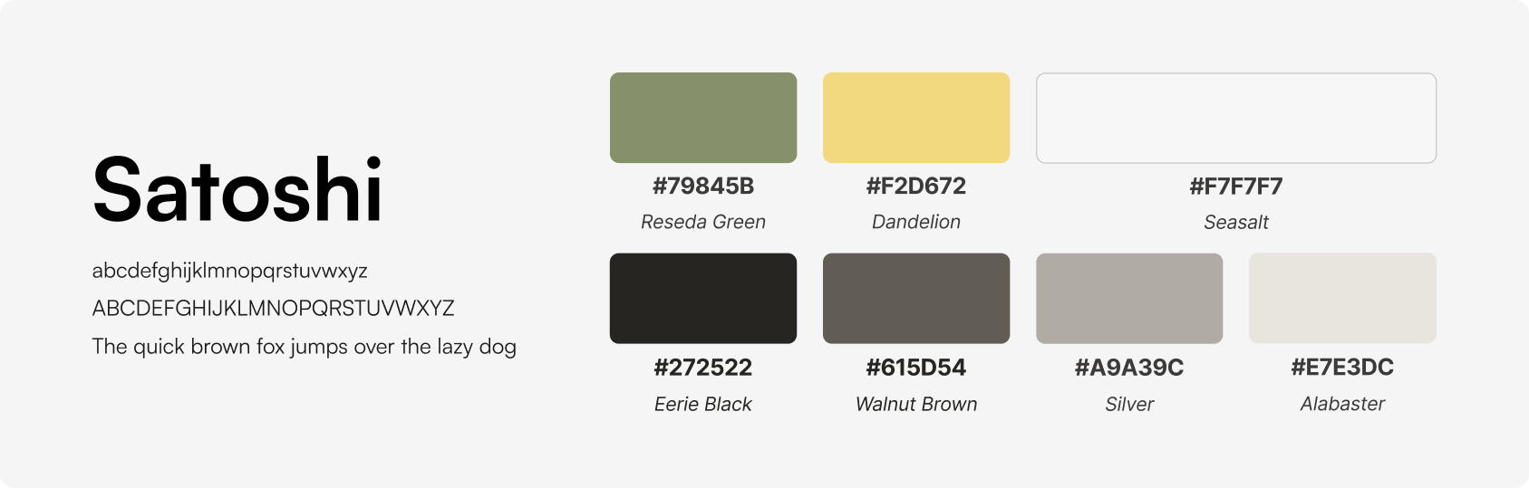
The visual design draws inspiration from the life cycle of a dandelion. Its soft, organic forms create a calming atmosphere.
Seeds represent individual moments and emotions

Growth represents continued reflection

Blooming represents acknowledgment

Final design
Solutions
The central challenge was designing a reflection flow that offered guidance without telling users how they should feel. I mapped the experience around choice: users could begin with a mood check-in, respond to a prompt, record a gratitude moment, or write freely depending on what felt manageable.
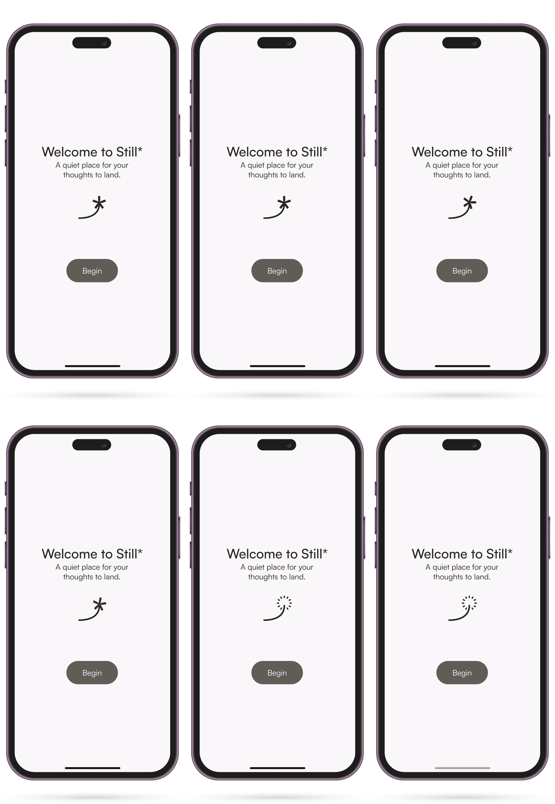
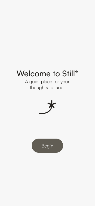
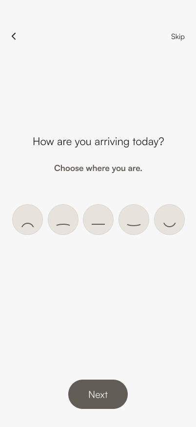
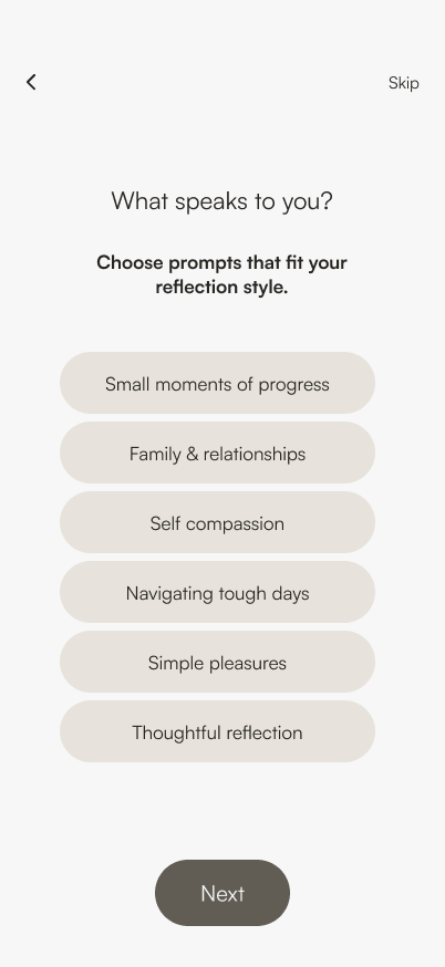
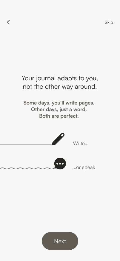
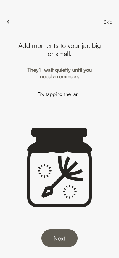
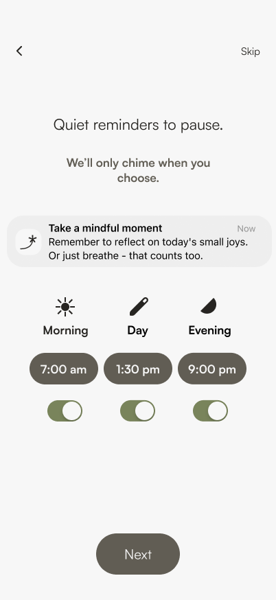
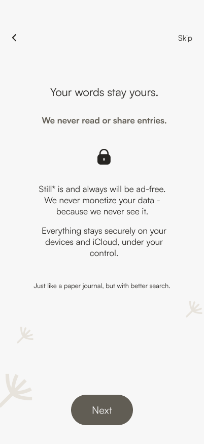
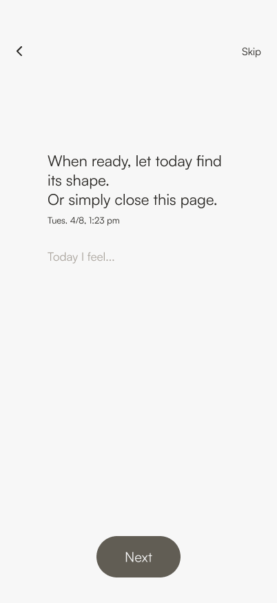
Onboarding
Focus on emotional entry over tutorial.
Onboarding
1
2
3
4
5
6
7
8
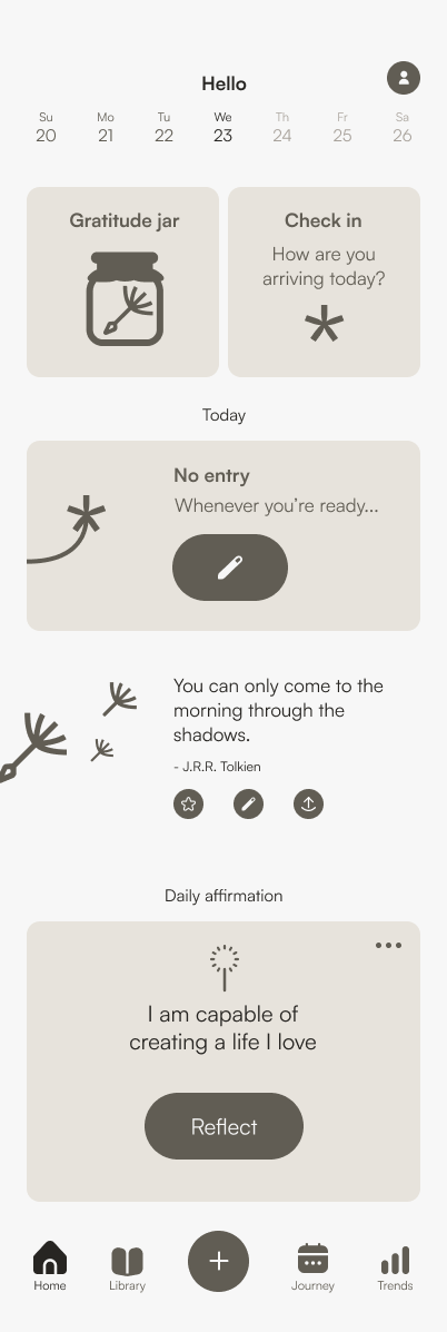
Home: a gentle place for daily reflection
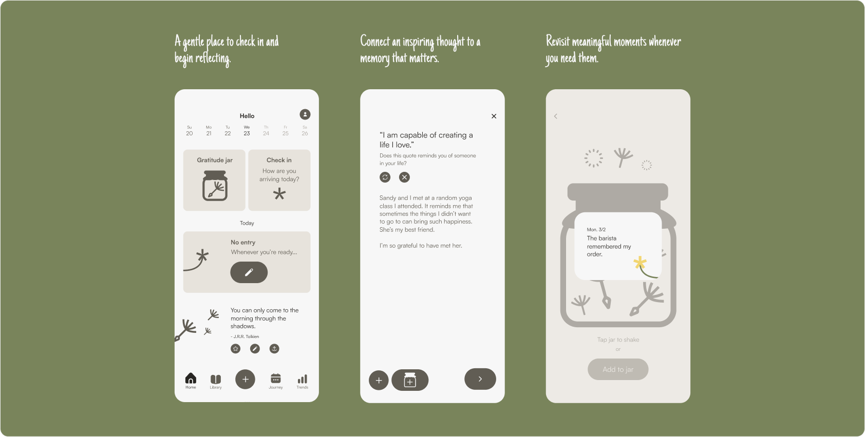
The home screen gives users easy access to an emotion check-in, the day’s journal entry, reflective quotes and affirmations, and their gratitude jar. There are no streaks or completion goals — only flexible entry points that let users decide how much they want to reflect each day.
Home
A reflection flow that follows the user’s emotions
Still* begins with a lightweight emotion check-in, giving users the choice to pause there or reflect further. When someone shares that they feel tired, for example, the app gently asks what may be contributing to that feeling before offering an optional prompt to recognize something that still brought comfort to their day.
The experience does not require users to become positive or arrive at a resolution. They can record how they feel without writing, continue reflecting at their own pace, or save a meaningful moment to their gratitude jar to revisit later.
Journaling flow
Gratitude jar
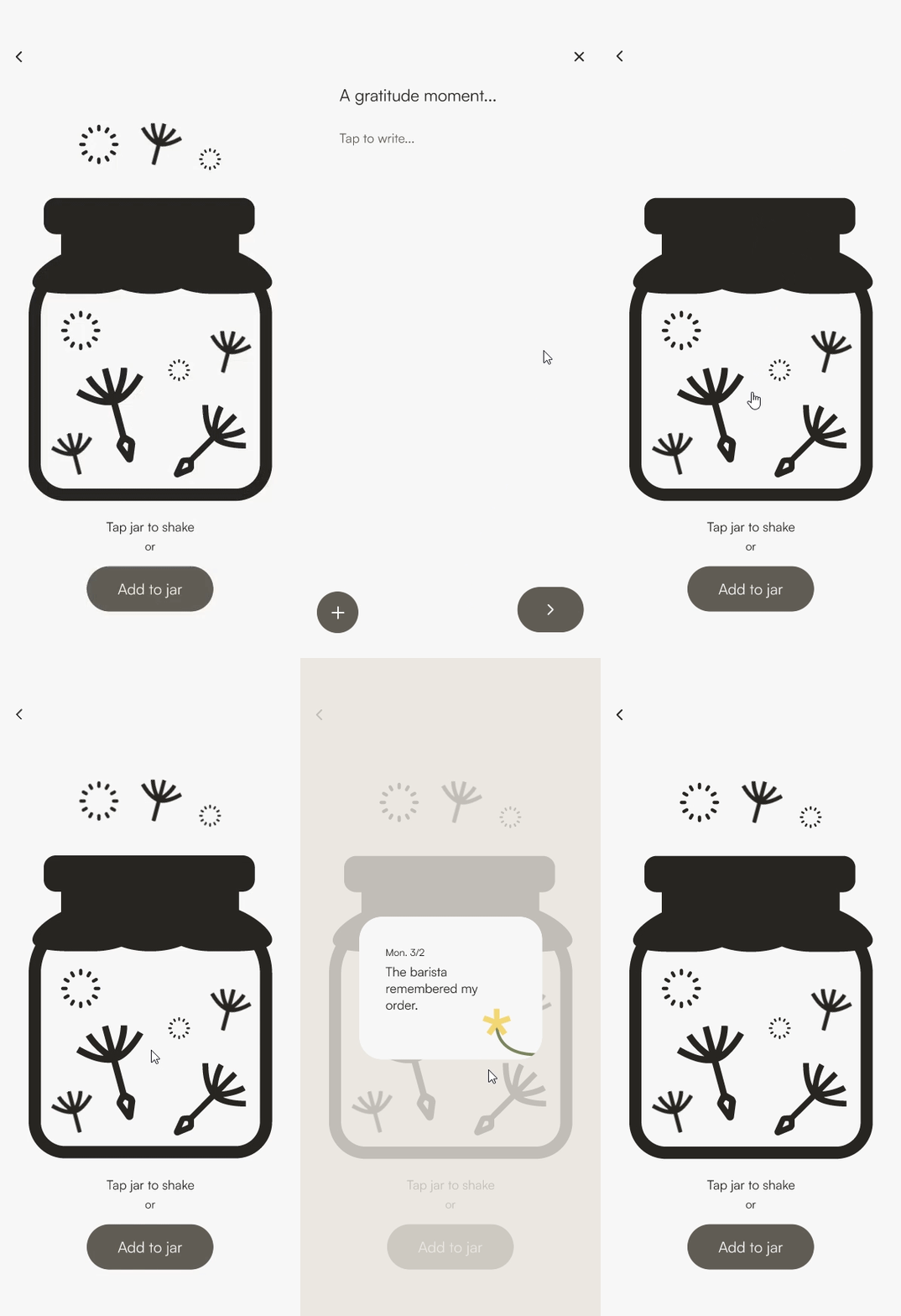
The gratitude jar collects reflections, memories, and moments users choose to save over time. Rather than functioning as a reward or daily goal, it offers a personal archive they can revisit whenever they want to reconnect with something meaningful.
Gratitude jar
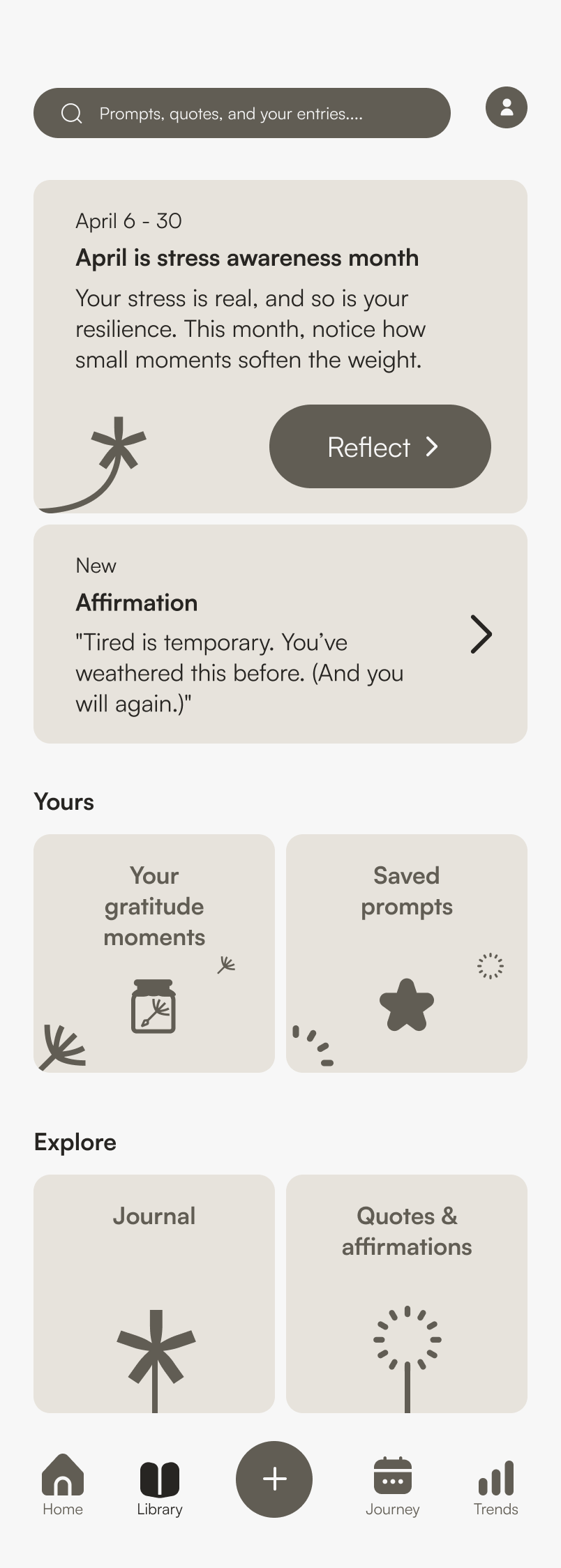
Supporting reflection beyond the journal
Library
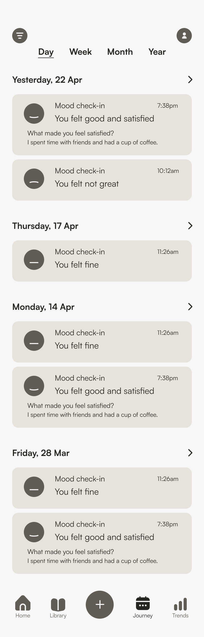
Journey
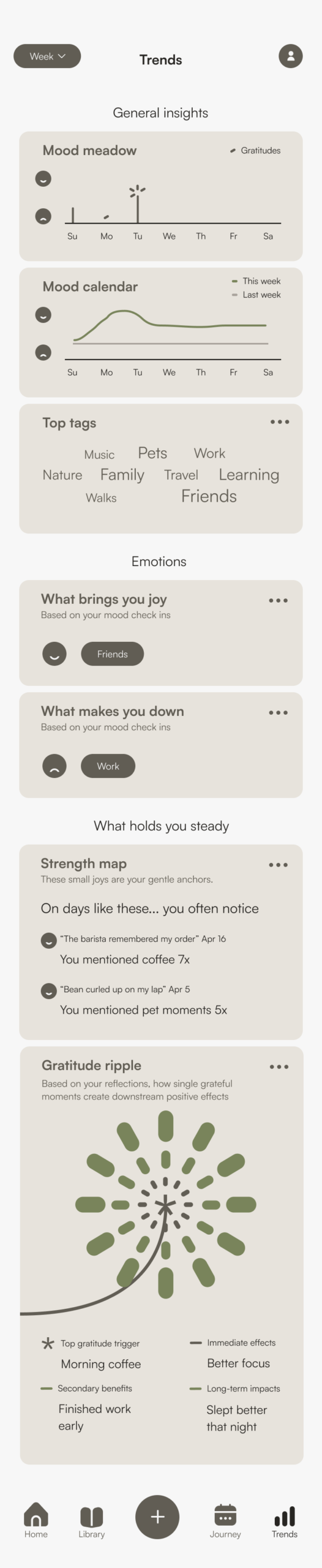
Trends
Reflection
What I learned
Still* began as a classroom assignment centered on gratitude journaling. Because the entire class was responding to the same prompt — and so many gratitude tools already existed — I asked myself how my approach could offer something different.
Online community research, a classroom talk from a psychology professor, and my own experience with journaling shaped the direction. I journal often, but I do not always arrive feeling positive. On difficult days, trying to force myself toward happiness can make reflection feel insincere. I found similar experiences in public online discussions, where some people described traditional gratitude practices as repetitive, overly cheerful, or disconnected from what they were actually feeling.
That did not mean gratitude itself was unhelpful. Instead, the challenge became finding a balance: how could Still* encourage appreciation while leaving room for struggle? This question pushed me to think carefully about the reflection flow and the language used throughout the experience. I explored multiple ways for users to check in, continue writing, or stop without being asked to resolve their emotions. Competitive research also showed that many gratitude apps relied on consistently upbeat language, which reinforced my decision to use a gentler and more emotionally neutral tone.
The project also challenged me to create a visual system that felt distinctive without overwhelming the reflective experience. Drawing from the life cycle of a dandelion gave Still* a familiar, organic metaphor for thoughts, memories, and gradual emotional growth.
If I continued the project, I would test the reflection flows with people who have different relationships with journaling, including those who have stopped using gratitude journals. I would evaluate whether the prompts feel supportive rather than corrective, whether users feel comfortable skipping or ending a reflection, and whether the gratitude jar remains meaningful over time. Broader, longer-term research would be needed before determining whether the experience has any effect on users’ well-being.
Fin.