Skip to content

Still* is a journaling app designed to help users reflect honestly on their daily emotions, balancing gratitude with the reality of personal struggle. Unlike traditional gratitude journals that emphasize only positivity, Still* invites users to acknowledge both difficult and uplifting experiences

My role
Product strategy & user research
User experience and interface design
Brand & content creation
Content writer
Results
Shipped a high-fidelity prototype
Developed the complete UX/UI, visual identity, and product copy from concept to final design
Designed a novel dual-aspect journaling framework and Gratitude Jar feature to validate all emotions
Still-App-Mockup-Gif-Rounded

The Problem

Studies show that journaling helps with emotional awareness and stress reduction. Gratitude-based tools boost positive affect, but often neglect negative emotions and can feel repetitive. Users of mood-tracking apps frequently skip logging negative moods, pointing to a need for emotional honesty in their experience.
There’s an opportunity for a journaling app that supports both gratitude and struggle, one that lets users reflect honestly without pressure to be positive.

Competitive Analysis

Key takeaways:
Simple journaling is common.
Apps often push positivity over honesty (Positivity-focused apps like Gratitude).
Some offer deeper reflection (Stoic) but can feel clinical.
To differentiate, Still* can balance positivity and struggle, offer privacy options, and mix simplicity and depth.
App icon of 3GoodThings
App icon of gratitude
App icon of Stoic

User Research

What users specifically expressed:
Through user interviews, people said traditional gratitude practices feel unrealistic or invalidating when they’re overwhelmed. Several felt guilty when they couldn’t think of positive things to write, or when journaling didn’t immediately improve their mood.
People worry that focusing ONLY on gratitude minimizes real problems.
Some feel “guilty” when they can’t be positive.
Journaling consistency breaks during difficult periods.
They want prompts that support tough days too.

User Personas

User persona of Alexa Ellings, the overwhelmed professional
User persona of Levi Guerto, the emotionally aware student

Design Strategy

Design must acknowledge emotional duality
Copy must be gentle and empathetic
Users’ reflections must feel safe and local
Interface should be clean but invite deeper reflection

Key Features

Dual Entry System
Allow users to write about both gratitude and challenges in the same entry, so they don’t feel pressured to ignore their struggles.
Gratitude Jar
Shake up your day with a surprise reminder of past joys. A collection of your grateful moments, ready to lift you up when you need it most.
Trends
See your top emotions, activities, and what makes the user feel up, what makes them feel down, and what strengths keep them strong.

Information Architecture

Chart of informational architecture of the app STill*

User Flows

Onboarding user flow
Main journaling interaction user flow
Onboarding user flow for the app still*
Journaling interaction user flow still*

Visual Design

Still* uses grounding neutrals with soft contrast to reflect emotional safety.
Typography is minimal and friendly.
The visual direction takes inspiration from the stages of a dandelion.
Colors are checked for WCAG AA compliance.
Color palette of the app still*
Typography for the app Still* and the different weights used. The font is Satoshi.
Dandelion asset of the app Still*
Seeds represent moments of struggle and gratitude.
Dandelion motif of Still*
The main motif of Still*, uniting the journalistic asterisk and a flower.
Growing flowers show feelings taking shape.
dandelion in full bloom asset for still
Full blooms represent letting go and feeling understood.

Onboarding

Onboarding screen 4, talking about how journal adapts to user, and user can write or speak to create entries
Focus on Emotional Entry Over Tutorial
Why: Traditional app tutorials can tedious. To align with the app’s purpose of authentic reflection, there is the option to bypass a feature walkthrough.
How: The flow begins with a mood check-in (“How are you arriving today?”). This immediately validates the user’s emotional state, framing the app as a responsive tool rather than a rigid product. It teaches through doing.
Progressive Disclosure to Avoid Overwhelm
Why: A gratitude journal that also acknowledges struggles is a nuanced concept. Presenting it all at once could confuse or overwhelm new users.
How: The value proposition is revealed sequentially:
Screen 1: Establishes the app as a “quiet space” for the user’s “whole story."
Screen 5: Preview the Gratitude Jar as a core delight, not a requirement.
Onboarding screen 5, showcasing gratitude jar feature
Onboarding screen 6, decide on notification permission
Onboarding screen 7, privacy notice
Permission & Autonomy as Core Principles
Why: To combat the pressure and guilt sometimes associated with wellness apps.
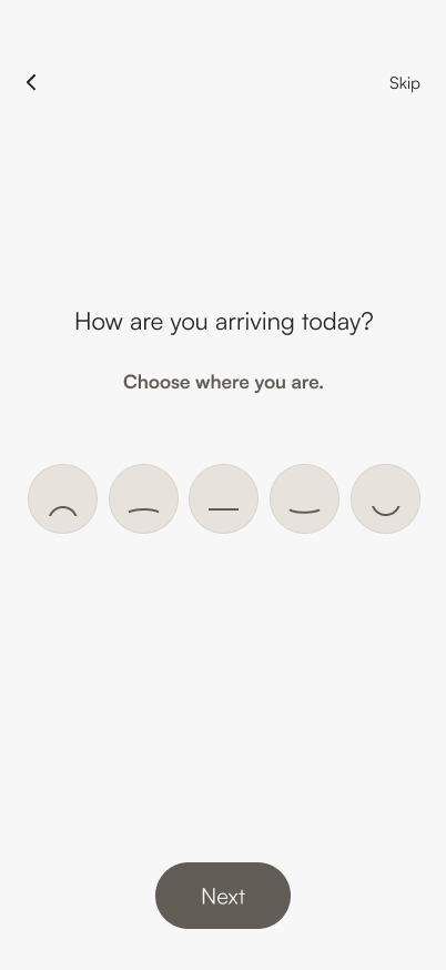
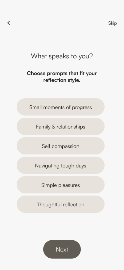
How: Through skippable steps:
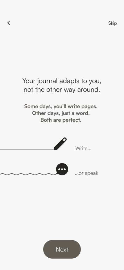
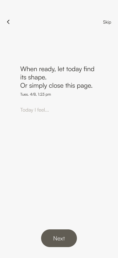
Low-Stakes Language: The first writing prompt uses “When you’re ready” and “simply close,” explicitly giving users control.
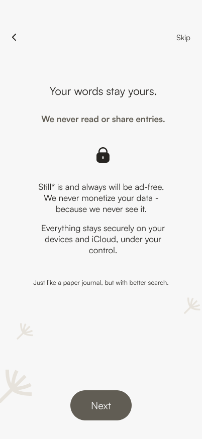
Privacy First: The privacy promise is presented as a core benefit, not a legal obligation, to build essential trust before the first entry.
Cohesive, Calming Aesthetic as Functional Design
How:
Pencil & Dandelion Motifs: Communicate gentleness, growth, and imperfection – key brand values.
Limited Color Palette (Brown/Warm White): Creates a focused, serene environment.
Slow Transitions & Ample Whitespace: Reinforces the app’s pacing as deliberate and non-demanding.

Home & Journaling Flow

Wireframe screen of homepage of the app Still*
The homepage is the manifestation of the app's core philosophy. By placing the Gratitude Jar and the Journal action side-by-side with equal visual weight, the layout visually communicates that processing challenges and collecting moments of light are equally important. This composition frames the app as a tool for holistic reflection, not just positive thinking, reducing pressure by offering two equally valid paths forward,
The flow begins with emotional validation, then guides reflection using adaptive prompts that respond to the user's mood, ensuring heavy feelings aren't met with forced positivity. It integrates the Gratitude Jar organically, letting users save light moments as they write. This creates a single, balanced process that concludes with gentle affirmation, focusing on reflection and emotional release.

Gratitude Jar

The Gratitude Jar stores meaningful moments. Users can revisit these when they need emotional support.

Supporting Features

Return to your reflections with purpose. Explore your entries by theme or prompt, retrace your steps chronologically in your Journey, and uncover meaningful patterns in Trends, seeing not just what you wrote, but how you've grown.