Team Concept
Product Design
TOAST
Designed an AI-assisted study planner that helps college students turn scattered course materials into a weekly plan they can understand, adjust, and approve.
Role
Lead Designer & Project Manager
Team
2 Designers + 1 Researcher
Original Duration
Feb 2026 - April 2026
Redesign
Self-directed
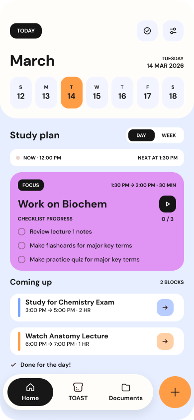
Home - Day View
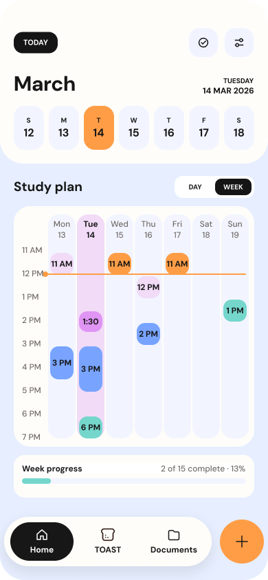
Home - Weekly View
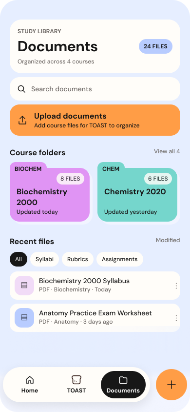
Documents Library
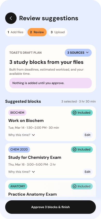
Documents - Review Suggestions
What TOAST is - and why it matters
The Product Problem
Important work is spread across syllabi, documents, calendars, and learning platforms; students still have to assemble it into a realistic plan.
The Design Response
TOAST reads course materials, drafts daily and weekly study blocks, and connects every suggestion back to its source.
The Control Principle
Students can review, change, exclude, or approve TOAST’s draft before anything reaches their calendar.
My Scope and Evidence
I led the original team concept and four moderated sessions, then independently redesigned the core workflows and visual system.
An original team concept, revisited independently
TOAST began as a three-person academic project built from professor-provided research about student stress, planning, and AI. I later revisited the product independently to strengthen its visual system, redesign key workflows, and make its approach to AI-assisted planning more explicit and testable.
Original Project
Led planning and design direction, assigned work, shaped the core flow, and designed Home, Weekly View, Add Task, Edit Task, Work with TOAST, and the Documents experience.
Self-Directed Redesign
Rebuilt the calendar, task, document, review, confirmation, and focus-session flows as one Academic Playbook system. The redesign has not yet been tested with students or implemented.
Decision 01 - Treat AI output as a draft - not a decision
Why it Mattered
A generated schedule can save time, but unexplained recommendations can make students feel that the system has taken over their planning.
Decision
I designed Review Suggestions to reveal TOAST’s sources and scheduling rationale while letting students edit, exclude, or reject each block. Nothing reaches the calendar until the student approves it.
Design Impact
Source traceability, “Why this time?” disclosures, live selected totals, explicit approval, and a “Save without schedule” path make control visible in the interaction.
Decision 02 - Make the product’s point of view visible
Why it Mattered
Day, Week, and Add Task were individually usable, but showing navigation alone made TOAST look like a generic planner.
Decision
I reframed the core experience around a complete student journey: import course materials, review TOAST’s draft, approve a plan, see it across Day and Week, then begin a focused study session.
Design Impact
The workflow now demonstrates TOAST’s value at the moment it matters - from scattered source material to an understandable, student-approved next action.
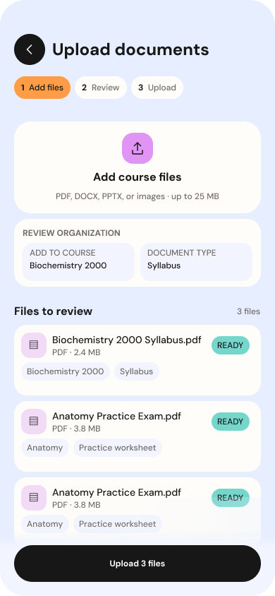
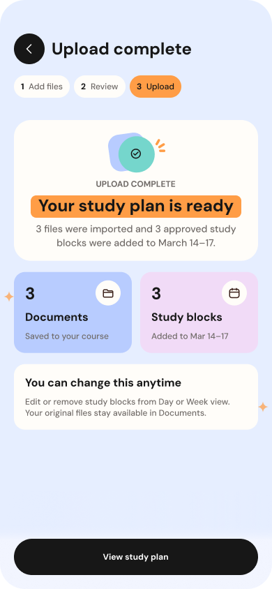
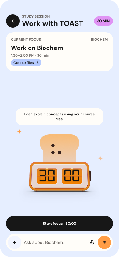
Decision 03 - Create continuity without flattening every screen
Why it Mattered
Calendars, forms, document libraries, AI review, and focus sessions serve different jobs. Repeating one card pattern across all of them made the product feel generic or cramped.
Decision
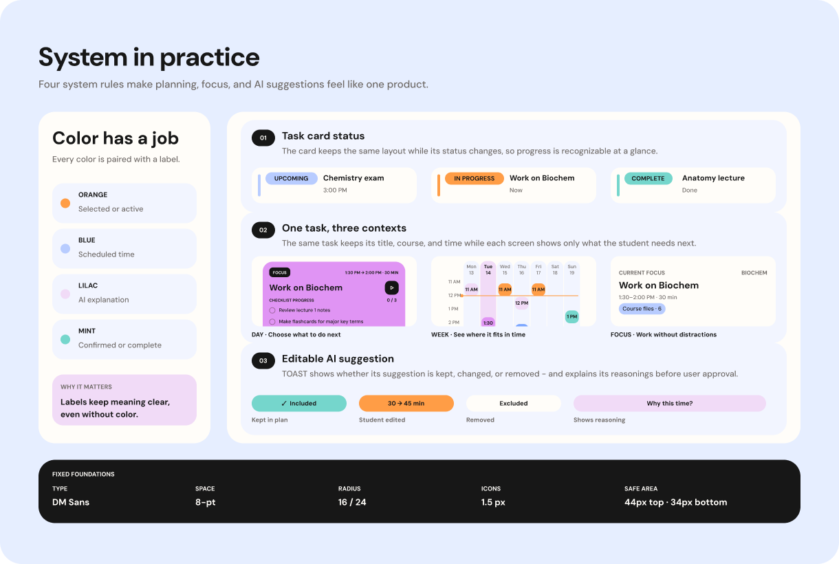
I established the Academic Playbook system - shared typography, spacing, color, radii, iconography, navigation, safe areas, and interaction rules - then adapted hierarchy to each screen’s task.
Design Impact
Day emphasizes the next action, Week maps time, Review foregrounds consent, and Study Session removes global navigation to protect focus.
What testing changed - and what remains unproven
Four moderated sessions shaped the original concept. The later redesign is a self-directed prototype and has not yet been tested with students or implemented.
Original Finding
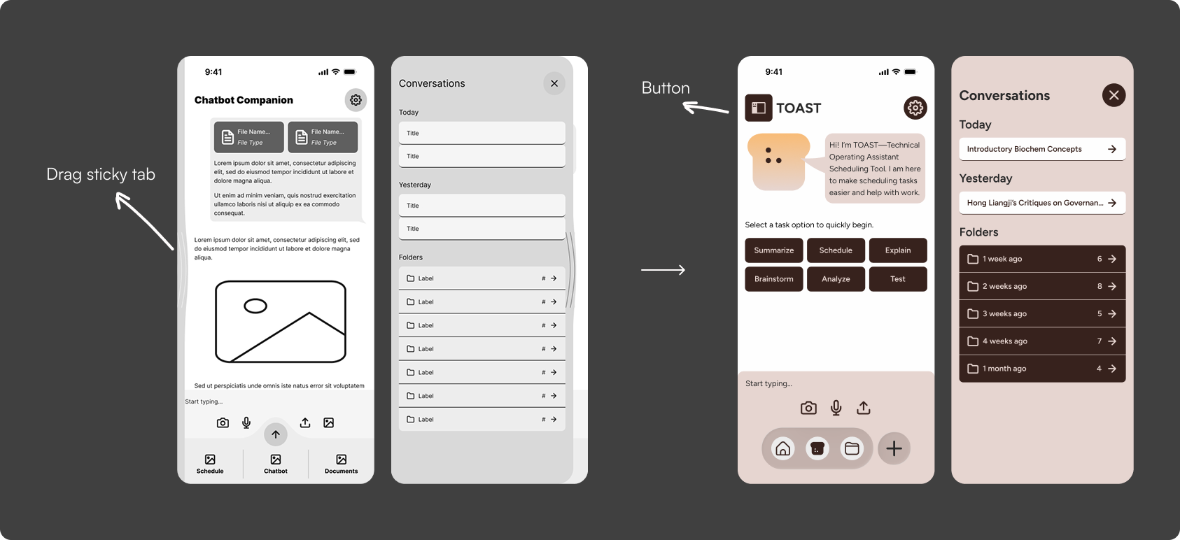
4 participants missed or misunderstood the draggable pullout.
Design Response
Added a visible button entry point while retaining drag as an optional shortcut. Show the before and after beside this statement.
Next Validation
Test whether students understand TOAST’s reasoning, feel in control of suggested schedules, and can move from documents to an approved plan without confusion.
What revisiting TOAST taught me
Make the Product’s Point of View Visible
My initial prototype demonstrated navigation between screens, but it could have belonged to almost any planner. Reframing the journey around documents, editable suggestions, student approval, scheduling, and focused study made TOAST’s distinctive value much clearer.
A Design System Should Create Continuity, Not Sameness
I extended one visual and interaction system across calendars, task forms, document management, AI review, confirmation, and focus sessions. Shared rules created continuity, while each screen retained the hierarchy its task required.
Treat AI Output as a Draft - Not a Decision
TOAST could not simply generate a schedule and expect students to trust it. I redesigned the review flow to reveal its sources and reasoning while allowing students to edit, exclude, or reject suggestions before anything reached their calendar.
Polish Includes Behavior, Not Just Appearance
The experience did not feel finished until I addressed scrolling, fixed actions, safe areas, touch targets, clipping, state changes, and transitions. Visual consistency mattered, but the product became credible through these smaller behavioral decisions.